In total there were 18 responses to the survey. For the results I will be refering to each of the instuintions as University 1, University 2, and University 3. Respondents were asked to find the contact information for each of the instutions. They also had to judge how easy it was to find the information, and the overall layout of the page. Layout is the overall look, usability and structure of the page.
Based on my SREC aproved survey, here are the results:
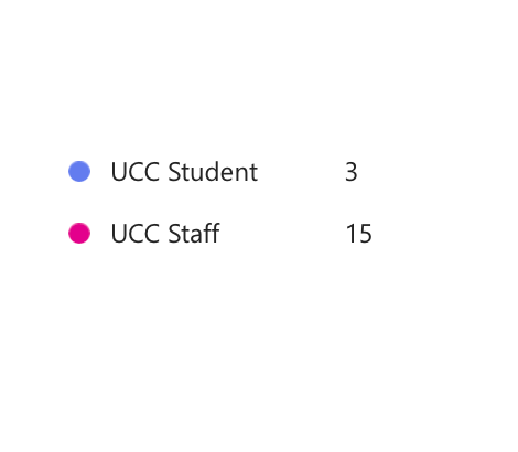

From the survey I gained 18 responses. the split was bias towards staff, with 15:3. This will impact another questions as some target students.
University 1
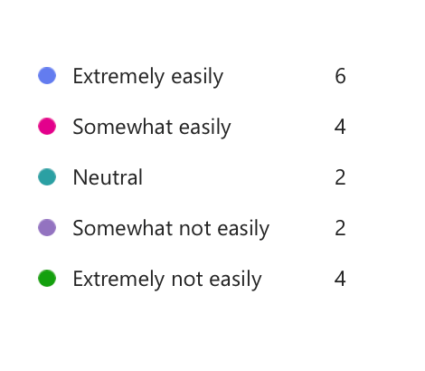
How easily did you find the information?


In this you see that University 1 over 2/3 of people were able to fine the information somewhat easily.
Overall we see that 89% of people found the information easily.
Such a strong result is a significant positive for this university
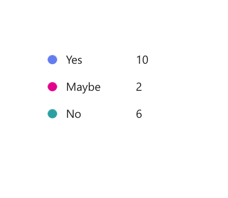
Did you like the overall layout of the site?

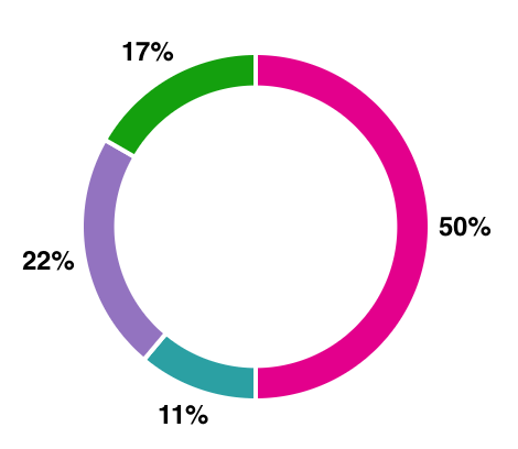
Overall 56% of people liked to the overall layout of the site. With 17% of people saying ‘No’. This means that 84% of people did not dislike the overall site layout of University 1.
Based on the opinions of the respondents University 1 provides a positive user experience.
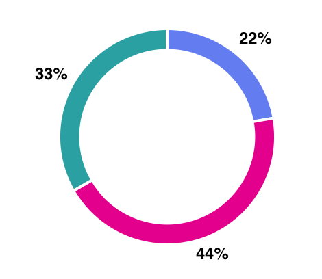
University 2
How easily did you find the information?

We see that 50% of participants found the contact information ‘Somewhat easily’. Also that 33% of people did not find the information easily. A zero “extremely easily” result highlights a need to improve in this specific area.
Did you like to overall layout of the site?

University 2 has the lowest positive user experience rating. Overall 44% of people said ‘Maybe’, which indicates that participants were overall unsure about the layout of the site. But still there were 33% said ‘No’ to liking the overall layout. Meaning that there areas in University 2’s site that could be approved upon to quickly improve the user experience
University 3
How easily did you find the information?
For University 3 overall 55% of people found the information easily, whereas 33% of participants found the contact details. This highlights that more people found the information than did not.
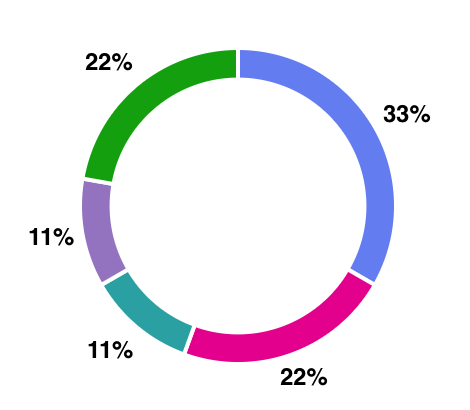
Did you like the overall layout?

In terms of layout and user experience response to University 3 was the most polarized. With the same positives as University 1 and negatives as University 2. Such a split could prove harder to resolve the issues as they may be due to personal preference rather than identifiable problems.
